WyzAnt Experience
WyzAnt is a Chicago based tutoring marketplace that connects student and parents with tutors for over 200 subjects ranging from Algebra to piano. I worked with WyzAnt for a year and half, and in that time period I was able to produce several accomplishments for their product offering and brand, including:
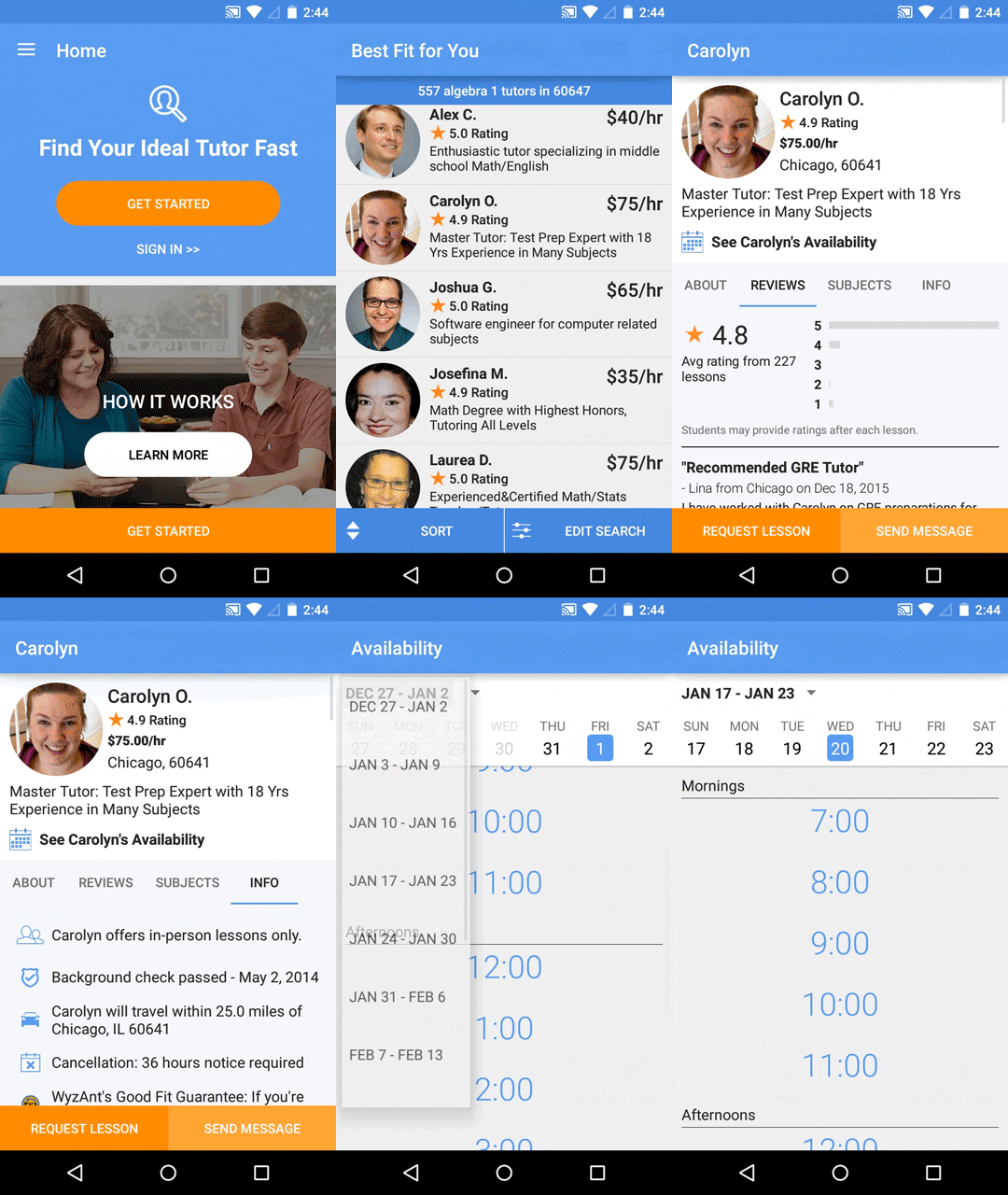
- Designing and launching an iOS and Android app to search and communicate with tutors.
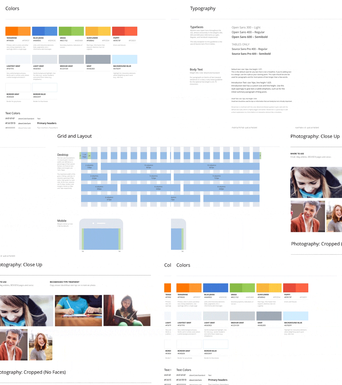
- Establishing a new and modern style guide to be used across all products and updating the brand.
- Managing and directing a cross functioning team of UX, UI, visual and contract designers to create new features and products.
- Introduced and lead the Creative Marketing team to sprint planning, point estimation, and a retrospectives to foster a better working environment.
- Managed the Creative Direction of the WyzAnt brand, including overhauling website, email layouts, producing photoshoots, and cohesion of style across all products.
I first learned about WyzAnt from one of our investors from FindIt. They were looking to start building out a mobile team in San Francisco, and were interested in my past experience of making websites with a strong product offering into a simple and successful mobile app. The opportunity excited me, it was a 10 year old company that had just raised a considerable amount, profitable, and was education focused. Their site was a bit outdated, but through my conversations learned that they were looking to make a serious commitment to being an Agile, design lead, product driven company.
Mobile App
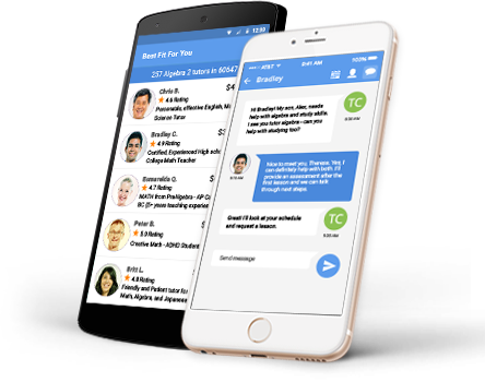
The main initiative at WyzAnt was to launch a mobile app for iPhone and Android for their students/parents. Getting the right experience out instead of simply a smaller version of a bloated website was the main goal that I was focused on.
Working closely with the product team, I mapped out what the ideal experience would be for a variety of potential students and parents with interviews and several usability tests with a variety of different situations and goals. We identified a number of use cases and potential routes we could take, and created a simplified and more direct version of the core product at WyzAnt with an enhanced and more enjoyable experience. I have a more detailed post where I go into more depth on the mobile app and its accomplishments.
Style Guide
One of the first and most rewarding challenges I undertook as the design lead for WyzAnt was to update the brand’s style guide. With many unique product launches on the immediate horizon, it was important that we were able to have a cohesive and unified UI system across all our products and channels. It was at this time I contracted and worked closely with an excellent Visual and Interaction Designer Veronika Goldberg to help us refine our look and style, while still staying true to the existing brand. We were able to remove outdated conventions, clean and simplify navigation, and build a styleguide that we could iterate and build the many future products we were planning on launching. With the new style guide we could approach four major products with a fresh aesthetic, and consistent experience across all platforms.
Homepage Redesign
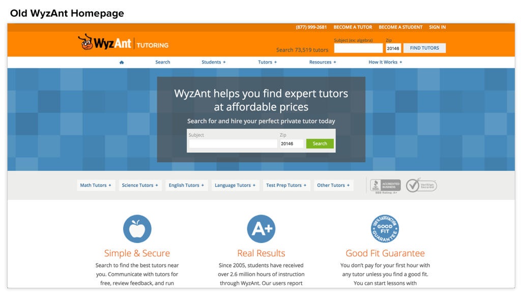
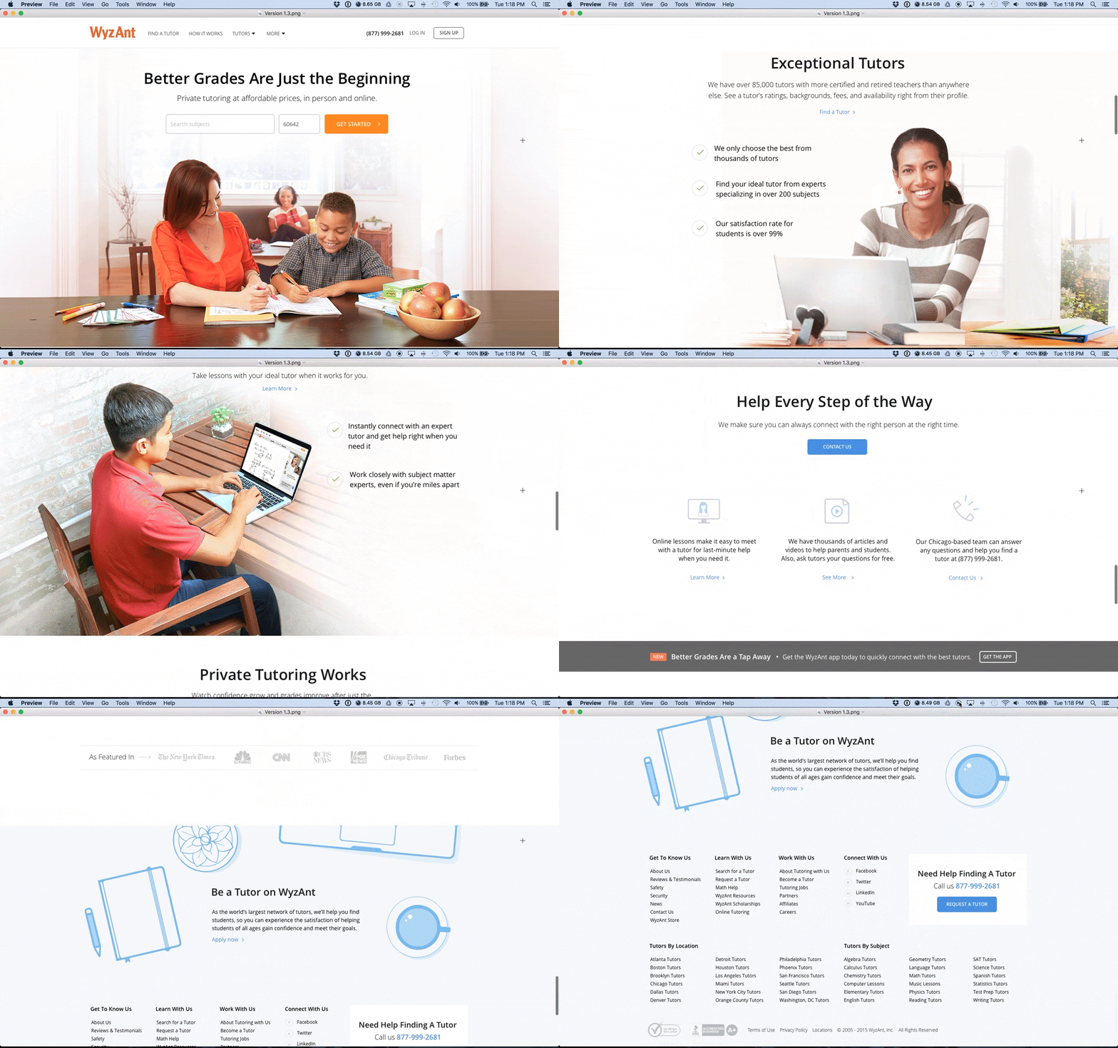
WyzAnt’s homepage was dated and tired looking, but also only accounted for 5% of total traffic. In a results oriented organization, seeing the intrinsic value to updating their homepage and brand was not a top priority, but when paired with the style guide updates we were already creating, an long overdue update was approved. The homepage we learned through some analysis, was not for converting new customers, but often as a validation as to if we were a trustworthy site. Seeing this as an opportunity to really capture the essence of what WyzAnt offered we began researching similar sites and began sketching.
Working with our content team, I was able to narrow down what our key messages were and how we wanted to represent them visually. Having unique imagery that could not be found on stock photography sites was important to us, and we were able to produce a small scale photoshoot using actual tutors and students who use WyzAnt. We had a number of storyboard sketches we were able to use to pose the shoot and successfully capture that friendly, approachable, and unique photographs for our update. This update would further solidify our brand as being approachable, aspirational, and trustworthy.
Working once again with Veronika Goldberg, we were able to create a compelling new look for WyzAnt, that when tested proved to lead more people to perform searches, interact with the navigation, and stay on the site longer. An added bonus was the ability to clean up the navigation and logo. This was an involved discussion of what to keep, how to prioritize, and what ultimately we could remove or consolidated. My personal victory in the long but eventual rebranding of WyzAnt, was to remove the ant head from our logo, which in many a user test several people thought we may be an exterminator service.
Managing designers
When I started with WyzAnt, I was only the second full time designer they have had, the other only recently starting himself. There was a huge number of projects, and not enough designers to get to everything in the timeframe stakeholders were pushing for. We had to grow, and fast, but interviewing and building a great team with the right skills takes time and a lot of effort. I was up to the task, but to supplement our small and nimble team I would find and manage a host of contractors to help get our products up and running.
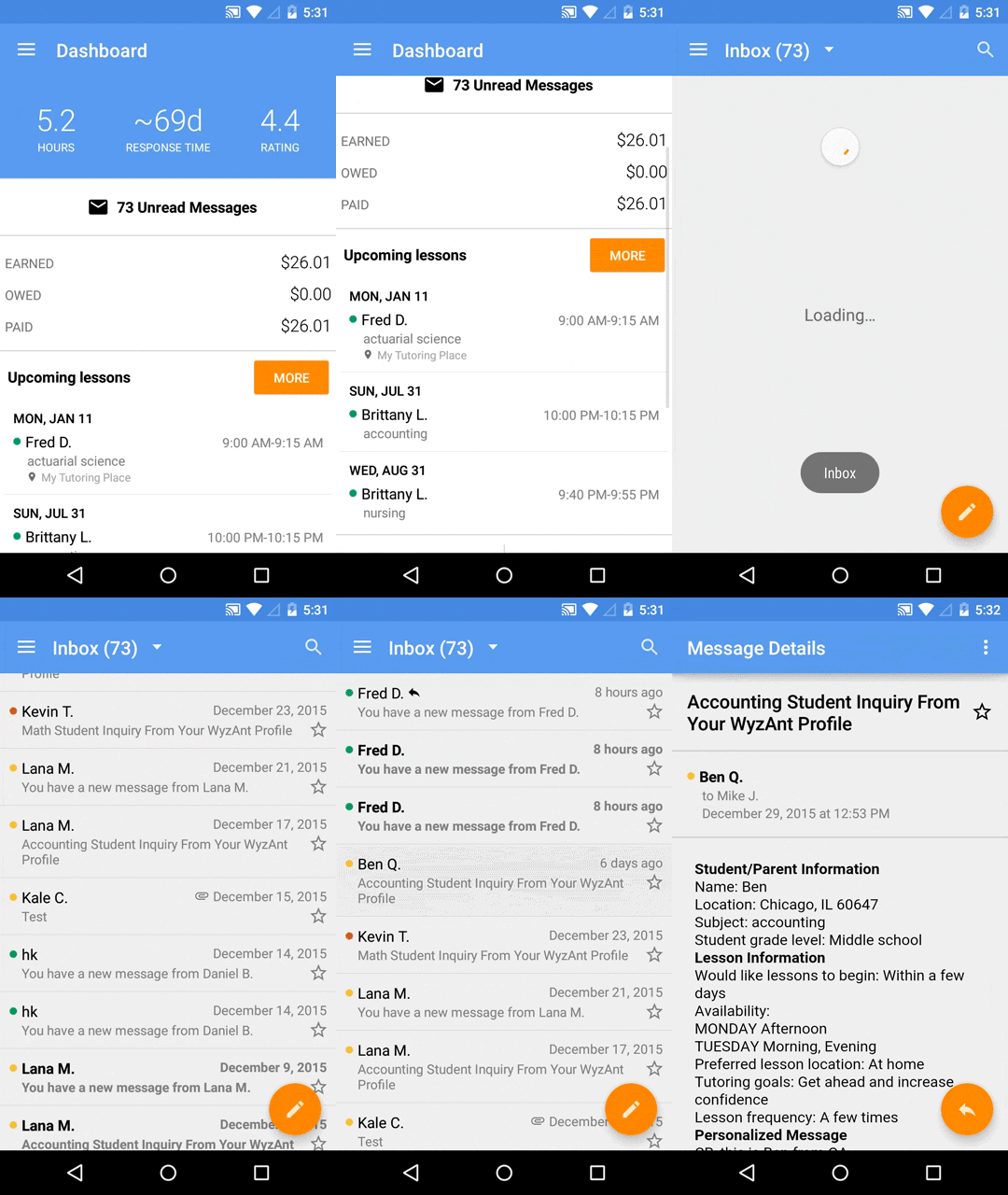
The first of these would be creating a tutor specific Android app, and fast follower a recently acquired online whiteboard tool allowing tutors to have remote lessons. I was still heavily involved with our desktop and first stages of student app designs and validation at this time, but was able to contract friend and past co-worker Tomoko Kanamitsu to jump in on the UX and UI designs for both products under my direction. Together we forged new experiences and iterated on the styleguide our growing design team was starting to solidify. Both products launched in record time and with validation from users tests were able to start converting to each products appropriate KPIs.
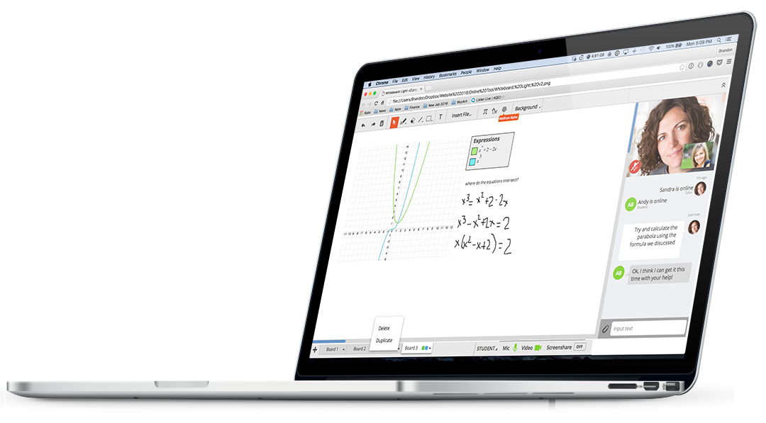
Eventually I was able to build my team with, a top notch Visual Designer to help with our growing marketing department and rebranding projects, as well as a Product Designer to continue building our Online Whiteboard tool and supplement our mobile expansion.
