In 2020, I undertook the challenge of leading the Facebook Assistant team to establish a unique identity, brand, and design system for the Assistant, spanning various platforms such as Portal, Oculus, and the innovative RayBan Stories devices.
Our design system encompassed four critical elements:
- Uniquely Branded Mark: We aimed to create a mark that not only stood out against competitors but also ensured easy recognition by users of Facebook products.
- Attention System: Defined as a visual indicator of the Assistant’s activity, listening status, and response states through motion design on Portal, Oculus, and other wearable displays.
- Bespoke Sounds (Earcons): Especially crucial for RayBan Stories, where there was no visual component, these sounds accompanied the attention system in different states—listening, processing, output, and error.
- Diverse Voices: We sought a unique set of voices to interact with users, offering a range of tones to ensure users felt comfortable and connected. This included the inclusion of a non-binary identifying voice actor to provide an authentic and inclusive experience.
Collaborating closely with conversation design expert Jessie Kitchens, we strategically chose Ueno, led by the talented Halli Thorleifsson, to partner with us in crafting the distinctive branded mark and motion designs that would become the foundation of the Assistant’s design system.
A unique challenge arose with the need for bespoke sounds or “earcons” to accompany the attention system. Engaging the expertise of the Facebook Sound Design Team, we ensured a seamless collaboration to align the auditory experience with the evolving identity and motion design.
In our commitment to inclusivity, internal teams recorded a variety of voices, including a non-binary identifying voice actor. This comprehensive approach aimed to provide a true range of voices, fostering a sense of safety and connection for our diverse user base.
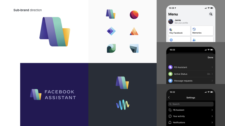
Navigating unexpected complexities, we found ourselves classified as a “sub-brand” by Facebook Inc.’s central branding team, necessitating integration with their evolving system of icons and brand guidelines. Despite misaligned timelines, we forged ahead within rough parameters, anticipating a realignment once the central branding team finalized their guidelines.

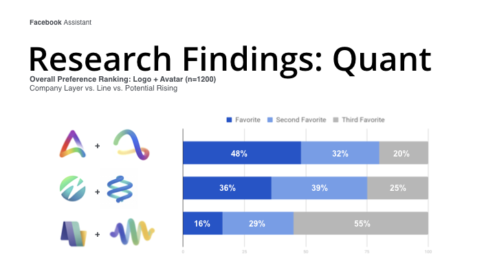
During this phase, user testing uncovered a misalignment with the desired attributes for the Assistant within the sub-brand framework. Consequently, we made the pivotal decision to shift from a sub-brand to a branded offer classification, granting us greater creative freedom to embody the personality and color scheme envisioned for Facebook Assistant.
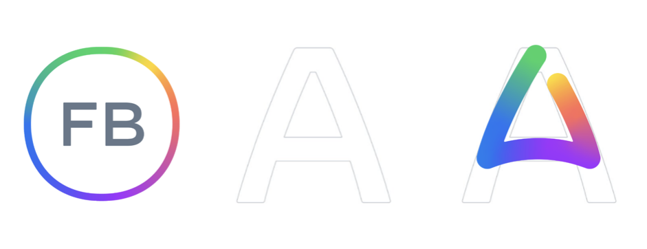
Collaboration with Reality Labs’ branding team opened the door to a broader set of ideas that aligned seamlessly with our evolving motion designs. A strategic shift in our color scheme, adopting the FACEBOOK parent company’s rainbow colorway, as well as adapting our mark’s shape to be in the form of FACEBOOK’s official font Optimistic, allowed us to embrace the spirit of the larger FACEBOOK company brand while avoiding the constraints of the “Facebook App” baggage. User testing validated the success of the new design, positioning us strongly against competitors.

In 2021, the culmination of our efforts materialized with the launch on Portal—a significant milestone as our branding adorned Portal TV boxes and seamlessly updated across in-use devices. Expanding our impact, we later launched on Oculus, solidifying the success of our collaborative journey in UX and brand design for Facebook Assistant.

