The Setup
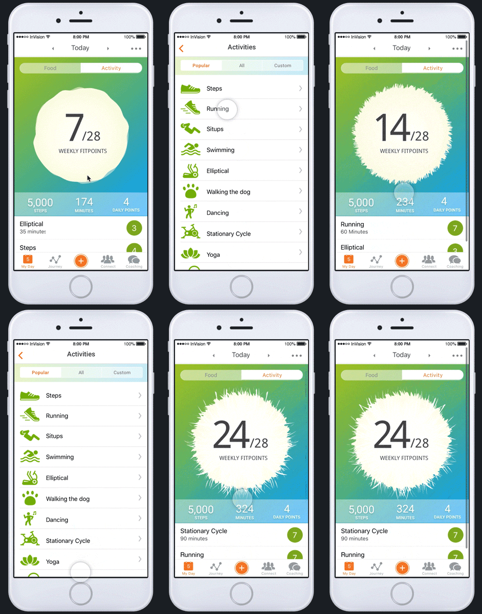
I joined Weight Watchers in 2016 as their Product Design Manager just after their launch of an update to their food tracking program. The updated program included a newer section to WW where members could track their exercise and activity, and if they wanted, swap earned “FitPoints” for more food or “Smart Points”. The position of WW on exercise and activity was a complex one, and for a company that has historically focused on what you eat, their members were confused on how they could best integrate activity into their lives. Because of the Activity Program suffered from lackluster engagement, leadership wanted to explore new ways to show members their activity metrics, as well improve member’s engagement with activity section of their app and website. With the general confusion with how FitPoints worked conjunction with SmartPoints, there was not an appetite to introduce new methods, radically change or update the program. This left me the challenge to trying to increase member motivation to track, excitement about activity within the app, and make it more clear the metrics the members had already earned or had left to earn for the week.
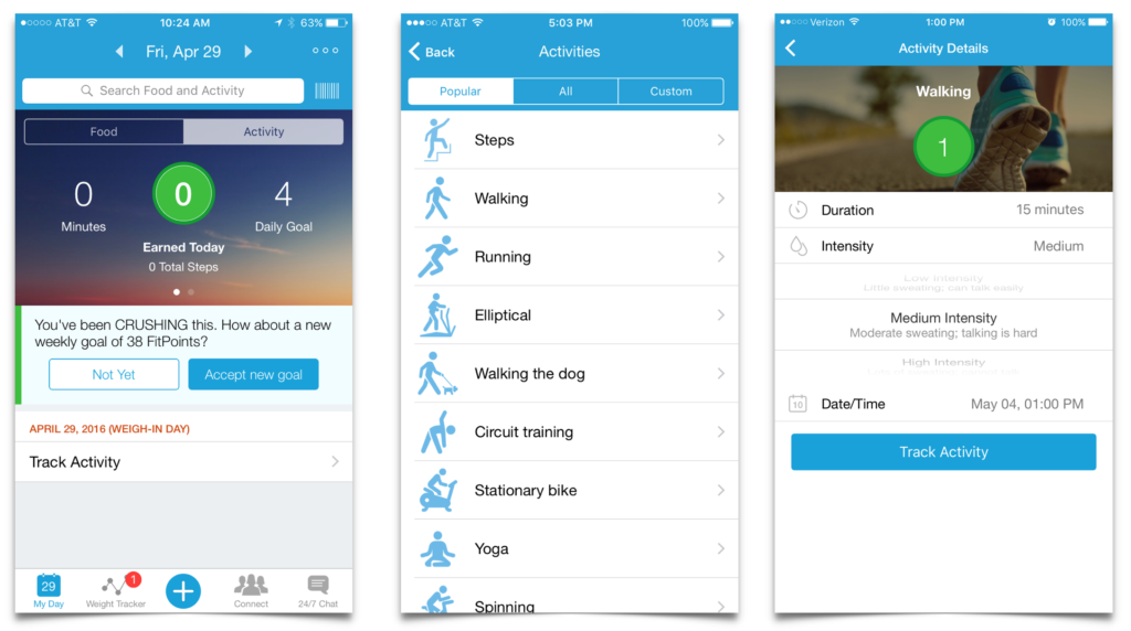
The biggest problems facing the program were:
- Confusion from members on if and how the could cash in or swap FitPoints for SmartPoints.
- Difference between a weekly and daily view of FitPoints.
- As a Product Designer, I could not immediately change the program dynamics, only the interaction and UI.
- Manually entering activity was cumbersome, and information from syncing to wearables was inconsistent.
- The company was about to go through a design refresh and the new design had to embrace the evolving aesthetic.
Research
To better understand the problem, I set up the task to learn more about our members, their backgrounds, motivations, and their journey with weight loss. Luckily we had an amazing UX Researcher who had just completed WW’s first round of persona research. We knew we had at least 2 persona’s that we could work with, Jennifer and Sara. Jennifer struggled with lifelong weight, and needed more of a guiding hand along her journey, where as Sara’s weight was recent and had success once she felt confident with the right tools. Understanding the dynamics of our members, we created a workshop with multiple members exploring other dashboards and UI systems from leading Apps relating to exercise and activity. We learned what was working, what they most responded to, and what they found confusing or intimidating. In parallel I started to conduct interviews with existing members mapped to our personas on how they introduced activity into their lives, and information they found most important and useful.
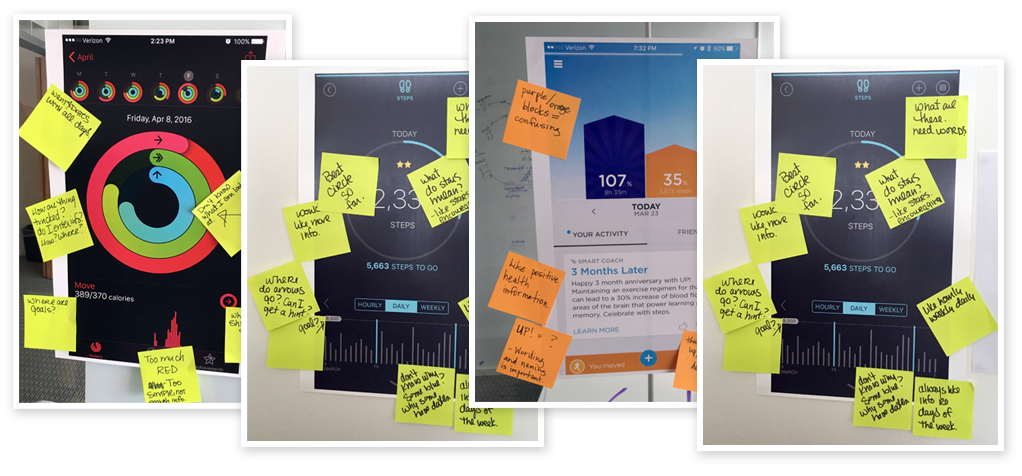
From the workshop and interviews I was able to learn or establish a few key learnings.
- FitPoints were confusing, but they liked seeing how many they earned
- Having the goal and seeing them meet or exceed it motivated them most
- Steps and time spent exercising was less important, but they liked to get the “credit” for doing them.
- Most members did not think about their daily activity, but more on what they accomplished during the week, as some days were busier or harder to devote time to be active.
Concepts
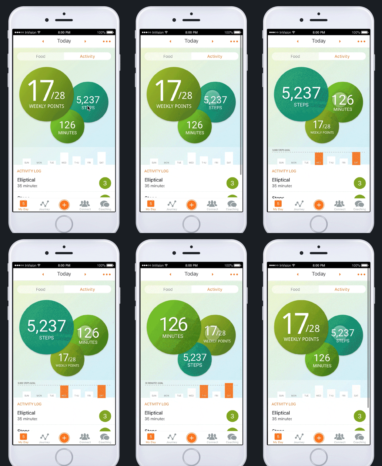
Taking the insights and learnings, I started to sketch and come up with new ways to present our members their activity information and narrowed my focus to 2 concepts that approached the problems we were trying to solve in different ways.
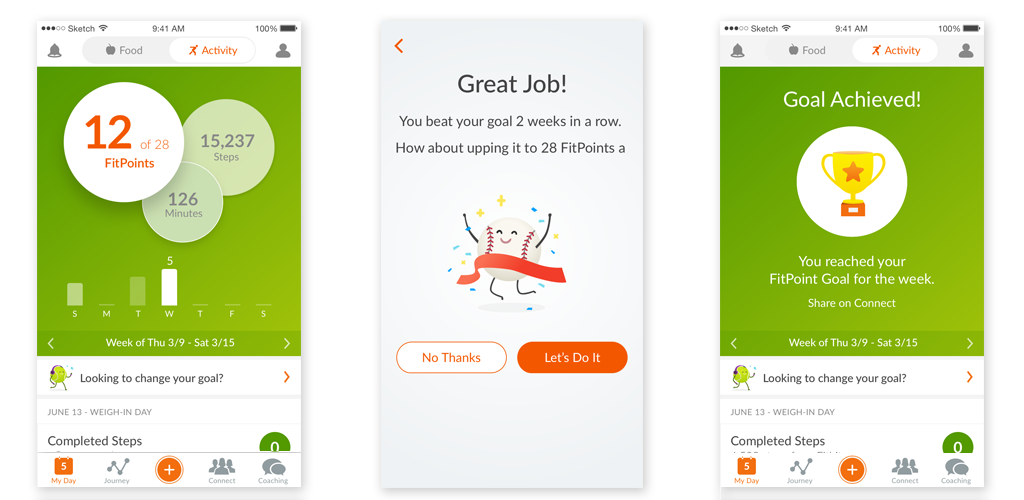
The first, which we called “bubbles” displayed the different dashboard metrics that were highlighted by a bubble container that was closest in the foreground. This new dashboard showed a weekly view only, but had a corresponding bar graphs that displayed daily progress as well. Members could then tap and cycle through different metrics, like steps and minutes, and see an updated and fun view of their progress, but still keeping the information accessible at a glance.
The next, called “energy”, also showed only a weekly view, but had a greater focus on FitPoints and the container for that moved with a speed and intensity correlated to how close they were to their weekly goal. The further away, the slower and calmer, where as the closer they were the faster and more energetic the dashboard reacted. I believed this to be more rewarding and building excitement on getting closer to a members goal but having a direct impact and ability to interact with their dashboard.
Validating Concepts
I refined the concepts to be clickable prototypes and ran the different options past members through online and some inperson testing to find out what about the concepts resonated with them. After testing over 10 members from different areas of the country and backgrounds, Bubbles was the clean leader, as it displayed more information they felt acknowledged their progress. Most of the members we tested resonated with playful energy was, but still found the how FitPoints related to their loss and the excitement of the dashboard. They enjoyed the direct impact they had on the dashboard of Energy, but it did not influence how they felt about doing activity.
While the results helped us to better understand what information was important for members at a glance, it also led us to conclude that members wanted to know more about what types of exercise would make them more energetic, calm, or strong.
Refinement
With test results in hand, it was time to start refining the design with the visual design team. They had been working on a refresh to the design visual system, and the Activity section needed to be updated along with the rest of the app. We planned to launch a beta version of the new Bubbles design for activity, and rather than launch with the old aesthetics and color scheme, we decided to iterate on Bubbles with the updated look and feel. Working together with our iOS and Android developers, we were able to clean up and play with the animations, transitions, and introduce movement into an otherwise fairly static app.
Testing
After a few sprints with engineering, we had a working version of Bubbles on the Android platform, allowing us to run some usability and comprehension tests with members in-person. With 12 participants we were able to conclude that comprehension of what was happening was high, and the information was clear, easy to understand, and interacting with the app was immediate and seamless, along with surprise and delight that they could interact with their information. However our research also lead us to the conclusion that motivation and general apathy for the activity section was still present, as well as continued confusion as to what FitPoints were was still poignant and persistent theme.
Final launch
Leadership was enthusiastic about the updated visuals, UI, and introducing interactivity into the app, however our conclusions that FitPoints was still a flawed system complicated our recommendations for launching the new UI. Because of our refresh of the design system across the rest of the app, and the fact that our new design did have an increase in satisfaction and comprehension, it was decided that we would launch the new design along with the rest of the app. This allowed us to then kick-off a second phase of iteration to rethink the entire activity system, and how we could better improve engagement, excitement, and capture association with positive feelings with activity that we were able to explore in the next section.
The overall launch of the updated Activity UI was a success in addressing some of the problems we originally set out to solve.
- We solved the difference between a weekly and daily view of FitPoints by simplifying the view and allowing more in-depth information at a glance.
- The design refresh and the new Activity Dashboard met and enhanced the new new WW aesthetic.
- We simplified the process for manual entry, but realized that automatic syncing of data from Apple Health or other wearables how to engage with members.
The two areas we were not able to solve or immediately addressed then became our new focus for phase two.
- Change the program dynamics and UI so that we could inspire and acknowledge members success for participating in activity.
- Rethink cash in or swap FitPoints for SmartPoints as the main use case for being active.
